CPG Design: A Look at Viral Trends + Real-World Examples & Strategies
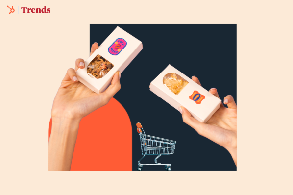
Graza. Fishwife. Brightland. These brands represent some of my favorite CPG designs. Marked by bright colors, bold fonts, and creative illustrations, this style of packaging is now moving beyond specialty stores and into big retail aisles.
Graza. Fishwife. Brightland. These brands represent some of my favorite CPG designs. Marked by bright colors, bold fonts, and creative illustrations, this style of packaging is now moving beyond specialty stores and into big retail aisles.
“If you walk into almost every major retail chain grocery store in the U.S., there would be at least one product that we designed, if not two,” says Mike McVicar, co-founder of Gander, a Brooklyn-based design studio.
To help you create catchy consumer packaged goods (CPG) designs, I’ve gathered insights from Mike that you won’t want to miss — as well as CPG design tips and real-life CPG branding examples to serve as inspiration.
Table of Contents
The CPG Design Pendulum
In the late 90s and early 2000s, good design wasn’t a priority for consumer packaged goods (CPG).
Packages with call-outs and stickers that scream “33% less fat” were the mainstream, a style that Mike endearingly described as “over the top, ugly, and kind of extra.”
When the 2010s rolled around, branding design went to the other extreme — the blanding trend.
Packages became too minimalistic and generic, often featuring sans serif fonts and pastel colors.

And now with the rise of social shopping, many brands are catering to the dopamine-charged, color-forward Instagram aesthetic.
It’s also a renaissance of the Y2K style, with bold colors and playful textures.
“The pendulum has swung toward ‘it can be fun again!’” Mike said.
Big brands love this trend, too.
From Jell-O to 7UP, they’re redesigning to dial up the dopamine and creating a visual identity that spreads fun and joy.
The Downside to a Trending Style
The problem with this trend?
It has led some companies to prioritize “doing it for the ‘gram" when they come to Gander.
“You find brands that just have very decorative design or only feel interesting aesthetically. It won't pay off for them in the long run, or even in the short run,” Mike said.
It’s problematic for brands to emulate what everyone else is doing, or recreating a trend, because:
- You’re assuming that someone else's solution is your solution.
- You’ll be easily replaceable.
- You’re not focusing on communicating your own brand values and differentiation to customers.
He also doesn’t believe the current dopamine packaging trend will stay for that much longer.
Differentiating CPG Brands Through Design
Back in 2015, Gander worked on the rebranding for Banza, a pasta made from chickpeas.
Contrary to the popular style on the pasta aisle back then (think Barilla’s simplistic blue packaging), Gander went for a bright and expressive style.

Banza was one of the early brands to make a bold statement with its CPG packaging, which impacted the food industry as a whole.
“Our ethos was to take an alternative food, and turn it into a CPG brand that has subverted what was expected for gluten-free pasta,” Mike said.
And it worked.
Banza went from anonymity to one of the top pasta brands in the U.S. It’s now in 25K retail locations nationally, including Target, Walmart, and Costco.
Since then, Gander’s helped many other CPG brands get on big retail shelves. Graza, whose design they helped build from scratch, hit $48M+ in revenue and can be found in 13+ locations.

Looking back at their big wins, Mike gave three simple tips for any brand that wants to stand out through design:
- Start with your story and history as a brand instead of following trends blindly.
- Understand who your customers are, what kind of world they live in aesthetically, and what’s pleasing to them.
- Look at your competition and see what opportunities align with your product and company that others aren’t doing yet.
5 CPG Branding Examples
1. NotCo

NotCo is a food company using its AI Giuseppe software to create plant-based alternatives to animal products like milk and yogurt. Their products such as NotMilk, NotBurgers, and NotIceCream are on the shelves of over 3,000 stores across the U.S., including Whole Foods, Sprouts, and Amazon.
What I like: NotCo uses vibrant colors and playful graphic illustrations to make plant-based alternatives fun and healthy. I also like the minimalist designs on their packaging which look easy to the eye and reflect their “less is more” ethos. They are also strongly committed to using sustainable packaging for their products, which appeals to eco-conscious consumers.
2. Olipop

Olipop is a U.S.-based beverage company that positions itself as a healthy alternative to soda. Its ingredients include plant fibers, prebiotics, and botanicals, which support a healthy gut. Olipop’s natural ingredients make them a favorite among health-conscious consumers, generating over $200 million in 2023.
What I like: There’s a lot to love about Olipop’s design. The bright color schemes and cheeky fruit illustrations are an attention-grabber. The product also highlights its prebiotic benefits and reduced sugar content to attract customers looking for tasty soda alternatives.
3. Chomps

Chomps is a snack brand that makes delicious, healthy meat sticks. They are famous for their Grass-Fed Beef and Turkey Jerky Sticks, which they make with sustainably sourced ingredients. Each stick has 10-12g of protein and zero grams of sugar, perfect for fitness enthusiasts. You can find Chomps in over 20,000 stores in the U.S.
What I like: Chomp’s eye-catching packaging has bold colors and fonts that pop at first glance. It communicates its unique selling points such as “100% Grass Fed & Finished,” “Non-GMO” and “Gluten-free” which resonate with healthy-conscious customers looking for a healthy snack.
4. Hiya Health

Hiya is a health and wellness company that specializes in daily children's vitamins and supplements. It was founded in 2019 by two new dads who discovered other vitamins contained sugar, artificial ingredients, or other gummy additives. They use essential vitamins and a blend of fruit and veggies to make their products.
What I like: I love Hiya’s simple design, bright colors, and fun illustrations, which capture the attention of parents looking for healthy daily nutrition for their kids. The packaging also displays the product's benefits and sustainably sourced ingredients, making it easy for parents to buy on the spot. Hiya generated $103 million in net sales in 2024.
5. Bobbie

Bobbie is an infant formula company that sells organic and sustainable baby formulas. They make their formulas with milk from grass-fed cows and are the U.S.’s only mom-founded and mom-led baby formula company. The company was founded in 2019 and surpassed $100 million in revenue in 2022.
What I like: Bobbie’s choice of soft color schemes on its designs creates a soothing effect and conveys a sense of trust and reassurance for parents. Its unique selling proposition, “complete nutrition modeled after breast milk,” is prominent on the packaging which would surely resonate with parents seeking a more natural way to feed their babies.
7 CPG Design Tips for Creating Attractive Packaging
Taking Mike’s tips (above) and expanding on them with some best practices and strategies, here are seven tips to achieve next-level CPG branding.
Tip 1: Understand your target audience.
Doing this lets you tailor your CPG designs and messaging to resonate emotionally.
Think about who are you targeting. Where can you find them? What are their needs, interests, values, and concerns? For instance, Millennials might prefer eco-friendly packaging with minimalist designs and GenZ might want eco-friendly and clear nutritional information.
Real-world example: Unilever’s Dove is an example of a CPG brand that knows its audience well. In 2018, Unilever identified a growing demand for elevated sensory experience, moisturizing benefits, modern design, transparency in ingredients, and sustainability in its products. In response, Dove revamped its personal care packaging to emphasize these values.
The result? Dove recorded double-digit sales growth compared to the previous year. Also, 74% of customers preferred to buy the new design according to Design Analytics.

Pro tip: Gather valuable insights about your audience using surveys, review platforms, online forums, and social media, and then use that to inform your design strategy.
Tip 2: Define your brand identity.
What do Nestle, Coca-Cola, and Nike have in common? A unique, recognizable brand identity that lets customers associate their products with trust, quality, and consistency. A strong brand identity makes your product stand out.
Whether your brand is playful, innovative, luxurious, or sustainable, your design elements — such as logo, colors, typography, imagery, and messaging — must consistently reinforce this identity. I believe this will help you build brand recognition and loyalty.
Real-world example: Take McDonald’s. Its golden arches and red and yellow color palette align with the brand’s image as a welcoming, family-friendly, and reliable choice, creating a sense of familiarity and trust with customers.
Pro tip: Develop brand guidelines to keep your design elements consistent across all branding materials.
Tip 3: Make the design functional.
While eye-catching package designs may capture attention, I’ve found that customers prioritize functionality when choosing a product — and for good reason.
Packages that are easy to open, reseal, transport, and store enhance the overall consumer experience and make your product more desirable. As such, people are more likely to become repeat customers and promote your product if it’s more convenient.
Real-world example: An excellent example is Ziploc bags, which I have used a lot. The brand became a household name thanks to its simple, innovative resealable bags, which keep food fresh, prevent spills, and are easy to reuse. In fact, it’s now a generic name for all reclosable plastic bags. (That’s when you know you’re made it!)
Pro tip: Balance aesthetics with function. Test your packaging to be sure it meets customer expectations.

Tip 4: Tell a compelling story.
A good story always captures attention, evokes emotion, and builds a meaningful connection with your audience. And the first step to telling an interesting brand story is to know your why.
As Simon Sinek famously said, “People don’t buy what you do; they buy why you do it.” Your story could be about your founder’s vision, the unique origins of your ingredients, or your mission to create a better world.
Whatever it is, I’d advise you to use elements like handwritten fonts, founder stories, or imagery that reflect your journey and humanize your brand. This takes your product from just another item on the shelves into something that builds connection with your audience.
Real-world example: Consider Ben & Jerry’s ice cream. Its packaging includes a Vermont landscape (where it was founded), a forward-facing cow, and a scoop of ice cream. The designs also feature bright colors, handwritten fonts, cheeky illustrations, and pun-based names, which fit the playful brand identity.

Pro tip: When shaping your brand story, think about how you want your audience to feel when they use your product.
Tip 5: Incorporate minimalism.
By removing unnecessary clutter, your brand’s messaging and unique benefits become the main focus. From experience, using ample white space, subtle colors, clear typography, and high-quality images in your packaging gives your brand a modern, professional, and premium feel.
Real-world example: RXBAR is a great example of this kind of “less is more” design. They also take their minimalism to the next level by using it to communicate ingredient transparency as well.

Pro tip: Less is more, but don’t strip away too much. You can highlight essential information, like your product benefits, ingredients, instructions, or unique selling proposition, to convince customers on the spot.
Tip 6: Promote sustainability.
There’s a growing wave of environmental consciousness globally, especially with the younger generation. According to Flexcon, 70% of consumers choose products based on the sustainability of their packaging.
Using eco-friendly materials, reducing waste, optimizing resources, and promoting recycling or reuse are effective ways to showcase your brand’s commitment to a sustainable future. I also recommend you add clear eco-friendly labels to your packaging to connect with customers who value sustainability. This will enhance your brand reputation and position your product as a more responsible choice in the market.
Real-world example: Clif Bar & Company is an example of a CPG brand committed to sustainability by using eco-conscious packaging. One of its objectives is to ensure 100% of its plastic packaging will be reusable, recyclable, or compostable by 2025.

Pro tip: Consider offering a discount or incentive for customers who return or reuse packaging to demonstrate your brand's dedication to sustainability.
Tip 7: Test, iterate, experiment.
Design is a continuous process. So let me remind you: don't be afraid to experiment and try new things. Conduct market research, analyze data, and gather feedback from customers.
Testing different packaging materials, sizes, and designs helps discover what works best for your target audience. Refine your packaging based on feedback and market trends to ensure your products align with consumer preferences.
Real-world example: Check out Organic Valley’s redesign. The brand originally used real photos of animals, kids, and farmers on its packaging. However, research showed this didn’t resonate with their consumers as they hoped. So, they overhauled the design. The outcome? A 10% sales increase within six months of launch.

Additionally, customers appreciated the new packaging, praising its farm-scene illustrations and distinctive modern design.

Pro tip: A/B test your packaging designs and materials in real life to make data-driven decisions and to ensure your product drives sales.
Stand Out with CPG Designs that Boost Sales
The right packaging design can significantly increase product awareness, strengthen your brand presence, and drive growth. However, as I’ve illustrated in this post, there’s no one-size-fits-all approach to creating CPG designs.
I recommend you start by understanding your target audience and then fine-tuning your brand identity to develop designs that resonate. Strive to balance aesthetics and functionality (I care about this and trust others do as well) to create a product that customers enjoy.
Also, allow your brand story to shine through the product while embracing minimalism and sustainability to align with modern consumer values. Finally, experiment to learn the design that will generate the most sales. After all, that’s the ultimate goal.
Editor's note: This post was originally published in July 2024 and has been updated for comprehensiveness.
![]()




.jpg)












![How Marketers Are Using AI for Writing [Survey]](https://www.growandconvert.com/wp-content/uploads/2025/03/ai-for-writing-1024x682.jpg)


































![311 Instagram caption ideas [plus free caption generator]](https://blog.hootsuite.com/wp-content/uploads/2022/07/instagram-captions-drive-engagement.png)


![Here’s Why Integrated Marketing Is So Effective [+ Best Practices]](https://www.hubspot.com/hubfs/Untitled%20design%20%2830%29%20%281%29.jpg)







![3 Short-Form Video Trends Marketers Should Watch in 2025 [New Data]](https://knowledge.hubspot.com/hubfs/ft-short-form-video-trends.webp)
![Anatomy of a Facebook Ad: How to Create Scroll-Stopping Campaigns [+ Examples]](https://www.hubspot.com/hubfs/anatomy-of-a-fb-ad.png)
![What Is a Media Mix & The Most Effective Types [HubSpot Blog Data]](https://www.hubspot.com/hubfs/media-mix-1-20250116-9700154.webp)
