Did Android 16 Need New Volume Control Designs? We Might Get Them.
We love UI changes in new versions of Android because they at least make things feel new, even if the feature set or other list of changes doesn’t matter much to most of us. When Google changes the look of anything, we get weirdly excited in ways that I’m not sure make any sense, because … Continued Read the original post: Did Android 16 Need New Volume Control Designs? We Might Get Them.
We love UI changes in new versions of Android because they at least make things feel new, even if the feature set or other list of changes doesn’t matter much to most of us. When Google changes the look of anything, we get weirdly excited in ways that I’m not sure make any sense, because it tricks our mind into thinking that an update is much bigger than it is. So when we see that (maybe) a change is coming to the volume slider situation in Android 16, well, we had to share.
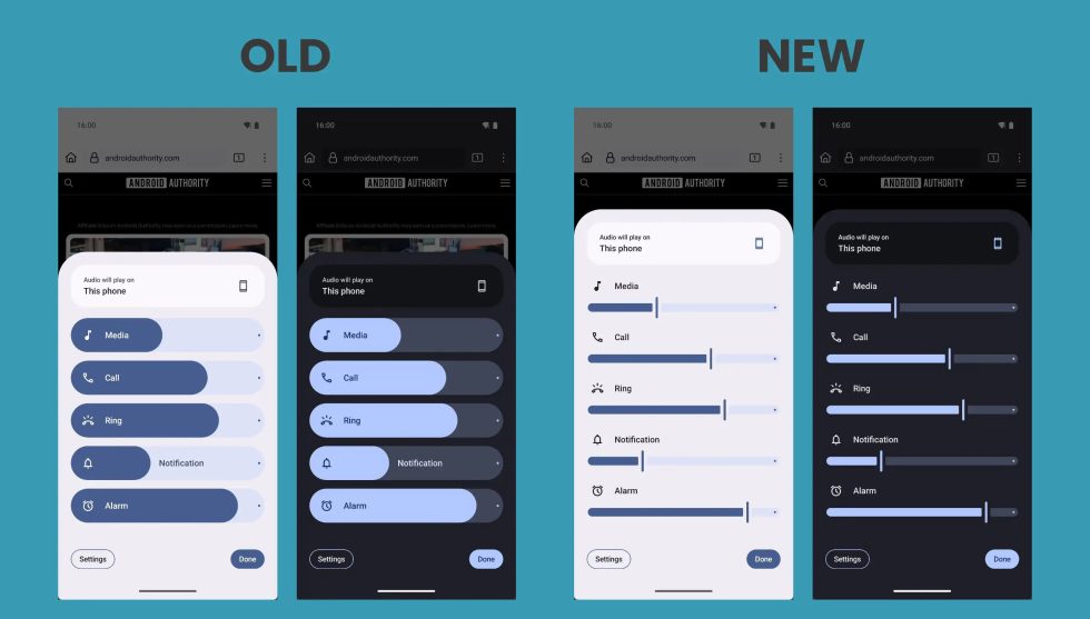
Below, you’ll see a comparison of the Android 15 volume panel vs. what could be the Android 16 volume panel. This was activated in the latest Android 16 Developer Preview 2 and is not yet present for just any ol’ user to see. I point that out because it could mean that we never see this. This is a work-in-progress sort of situation, although we do sort of hope it ends up landing in Android 16 later this year.
The new sliders for volume controls show a sliding bar with a line as an end point that marks where your volume level is. In the old version, we get these rounded bubbles that always sort of made it hard to figure out exactly where your volume was. A line feels and looks so much more precise than a rounded end, at least in my opinion.
Google has apparently worked this bar-line UI up in all volume areas, not just in this volume panel. You would see it when simply adjusting your phones volume too. Some of the volume UI elements may end up with a rectangular style too, leaving all of the roundness in the past.
When could we see this? No one knows. This was buried within DP2, so it could show up in Android 16 DP3 this month or at stable launch or never. This could simply be a UI style that Google is testing that will then be abandoned before being finalized. They actually do that often with changes in these builds, which is why they are reported on with “maybe” or “could” or “might” attached.
It looks nice enough, right? Or does it matter? It doesn’t. Again, we just like UI changes. We can easily be won over with flashy shirts covering piles of poo. Not that Android 16 is poo…you get what I’m saying.
Read the original post: Did Android 16 Need New Volume Control Designs? We Might Get Them.
What's Your Reaction?




/cdn.vox-cdn.com/uploads/chorus_asset/file/25829976/STK051_TIKTOKBAN_B_CVirginia_B.jpg)


